
Why the Interface Feels Like a Maze
First thing you notice: the landing page screams “modern” but whispers “confusing”. The hero carousel spins faster than a roulette wheel, and the call‑to‑action button hides behind a glossy gradient that blends into the background. Users swipe, they tap, they stare—nothing clicks. Look: when the primary navigation collapses into a hamburger icon on desktop, you’re already losing momentum.
Loading Times vs. Player Patience
Here’s the deal: page load spikes past three seconds, and the bounce rate spikes higher. A casino site can’t afford that kind of lag. The server responds with a 200 OK, but the front‑end assets queue up like traffic at a red light. Chrome dev tools show 1.8 MB of JavaScript that could be trimmed down to half. And here is why: every extra megabyte is a lost player, a silent revenue leak.
Mobile Interaction – A Slip‑Slide
Play on the go? Not so fast. The touch targets are teeny‑tiny, like trying to press a coin slot with a fingernail. Swiping gestures conflict with ad pop‑ups that pop up every time you scroll. The result? Frustrated thumbs, abandoned sessions. A quick audit shows the mobile CSS breakpoint is set at 1024 px—still a desktop mindset masquerading as mobile-friendly.
Visual hierarchy? Imagine a neon sign in a foggy alley. The color palette is bold, but the contrast ratio drops below WCAG AA in key spots. Users squint, they guess, they move on. The site tries to be avant‑garde, but ends up being avant‑garde‑confusing.
Security prompts are another hot spot. The SSL certificate banner flickers, then disappears, making users wonder if they’re on a phishing site. Trust is a currency; you’re spending it on shaky foundations. The login flow demands a password, a OTP, and then another verification step, all while the UI spins a loading wheel. That’s a triple‑hit on patience.
Search functionality? It’s a black box. Type “slots”, hit enter, and you get a generic “no results found” page that looks like a dead end. No filters, no suggestions, just a dead‑end message that feels like a door slammed shut. Users want a quick win, not a treasure hunt.
Bottom line: the user experience crumbles under its own ambition. You’ve got a slick visual brand, but the practical usability is an obstacle course. Streamline the navigation, trim the JavaScript, and respect the mobile‑first principle. And for the final piece of actionable advice: cut the carousel, replace it with a static hero image that loads instantly, and watch the conversion rate climb.
About the author :

Related posts
Popular products
-
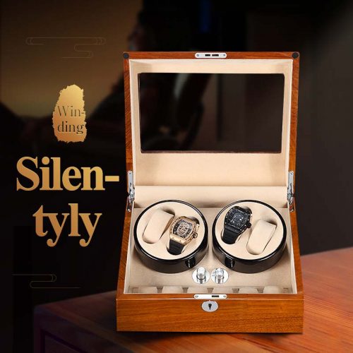 Solid Woid Watch Winder Box S0020 Series
$192.99
Solid Woid Watch Winder Box S0020 Series
$192.99
-
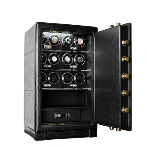 Dual Alarm Watch Winder Safe Box HP12 Series
Price range: $3,409.99 through $3,411.99
Dual Alarm Watch Winder Safe Box HP12 Series
Price range: $3,409.99 through $3,411.99
-
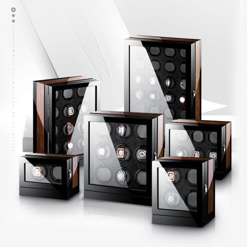 Intelligent Winder Watch Z8200 Series
Price range: $304.99 through $1,210.99
Intelligent Winder Watch Z8200 Series
Price range: $304.99 through $1,210.99
-
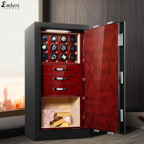 Watch Winder Safe Box B1120 Series
Price range: $6,815.99 through $6,817.99
Watch Winder Safe Box B1120 Series
Price range: $6,815.99 through $6,817.99
